Data Viz – Use Case Questions

When I’m asked to look into a Data Viz use case, there are a number of questions to consider, obviously “it depends”, but generally these are the sorts of things I think through, and I wanted to share as it might help you in your data visualization activities!

  • Use case and benefits: What is the use case benefit? Has that been signed-off on and agreed yet or do you need to analyse it first and engage with stakeholders? Is there a deadline for delivery?
  • Quick win or long term solution: Is this a short term solution or an urgent requirement to deliver a quick win? Or does it need to be operationally robust and require a more substantial design? Often you can deliver a MVP to provide immediate value whilst working on the longer term solution.
  • Data availability: Is the data sourced/available? Are there security implications? 3rd party sources? Technical implications (volume, velocity, variety…)? Is there a sample of data I can start working on? Beware the data iceberg
  • Data model: What is the size/complexity of the data set? Are there many sources? Is there a defined schema/data model? What data engineering might be required to process the data into structures to support the data visualization? Are you going to create a re-usable data product that can be used for other solutions?
  • Data quality: Do you expect to undertake data cleansing/data analysis? What challenges might there be with the with how the data is collected, is the right data being collected to support the use case?
  • Report timeliness: What is the expected frequency of updating the report (eg real time, intra-day, daily, weekly, monthly)? Always challenge stakeholders on what is really required, everyone would love real time data, but there is typically a lot more effort and engineering required to implement that kind of solution.
  • Report performance: Given the tools and technology (data engineering, data viz) available what are the possibilities or limitations? What are the performance considerations, do you have non-functional requirements to meet?
  • Logic and calculations: Are there any complex calculations expected with the data? Is everyone aligned on the calculation logic and definitions? What calculations to implement in the data sources, or the data engineering processes versus in the data viz tool?
  • Data viz type: What kind of data viz – management information, operational, analytical, infographic?
  • Reporting requirements: What is the reporting requirement, has it been defined or is it to be determined? Are there existing reports to use as a basis (pros and cons, particularly if Excel)? How many reports, different reports for different audiences and purposes? Simple barcharts/line charts/tables? Drill downs? More considered visualisations to present the data? What controls might we need eg to switch between mtd/ytd, time periods, variances, stastical models, etc?
  • Data story: Is there a story trying to be told with the data? What actionable insight will help consumers with what they need to achieve?
  • Data Security: Do you need approvals to be allowed to handle the data? Are there handling implications? Is row level security required on the data viz? Any other security requirements? Any data privacy considerations?
  • Support and training: Who is going to support the solution in the long term? What documentation is required (obviously good practice to add code comments, etc)? Will users require training to use the solution? How best to deliver?
  • Outputs and self-service: Further outputs (subscriptions, PDFs, etc)? Do you expect users to access and work with the underlying data and therefore given the tool technology, what is the best set-up for self-service?

Each of the above questions could be an in-depth article in-itself and there are all sorts of other things that could be considered, but these questions are a good starting point.

The earlier you can get hold of the data and start analysing it and understanding the data and the domain, the easier it gets to iterate to a good solution.

Also, can you do this all yourself, or do you need to put a team together? If you have good collaboration with stakeholders and the team you are working with, you can iterate to a succesful solution much more quickly and the benefits are more likely to be realized.

Becoming an expert at Data Visualization

Data Viz Expertise

In my company, I’m recognized as an expert in Data Visualization, both through my expertise and my company wide community work to help educate and support work on data solutions across the company. (Expert is a relative term of course, but I think I know more than most!)

What do I mean by my expertise, here are some examples:

  • I’m able to engage with stakeholders to understand the use case, elicit requirements and explore and iterate towards a solution.
  • I have a good sense of design and a level of creativity which enables me to put together a dashboard that enables the power of tools like Tableau and Power BI.
  • I can take a look at any dashboard and work with it’s creators to recommend how to improve it, applying visual best practices but also ensuring it provides actionable insight.
  • I can analyse data sets and work out data quality issues and make clear the actions required to address these, enacting process change when necessary.
  • I really understand how you want to set-up your data to meet reporting requirements for tools like Tableau and Power BI, whether this be working through business logic, data scaffolding or optimizing for performance.
  • I have a good level of tool know how and know the art of the possible or how to work out the answers if I don’t.
  • I don’t do all this work myself and have some great colleagues to work with, but I take the lead on providing the direction and approach and the ability to communicate what is required to data engineers, data analysts and visualization developers is key to this success.

How did this happen? Why am I good at this? What approach would I recommend to develop these capabilities?

A brief career history

I didn’t set out in my career to take this path, originally graduating with a Masters in Electronics and spending a few years working with mobile phones and other electronic solutions, I then moved towards IT, spending a fair few years developing project management and business analysis skills and working on a variety of programs and projects.

Back in 2013 I came across Tableau as an answer to a reporting requirement for one of our applications and immediately saw the potential of the tool (Tableau 8.0 at the time). Having had PMO (Project Management Office) roles as part of my career I knew first hand the frustrations of the Excel and PowerPoint ecosystem for reporting inefficiency.

Seizing upon this opportunity, I took it upon myself to self-learn how to get the most out of Tableau, working through the online webinars, reading blog articles, attending Tableau User Groups (London), reading books by Stephen Few and so forth.

As I connected with other like minded individuals across the company I initiated a in-company Tableau User Group to help raise the capability bar and encourage sharing of experiences as well as working with Tableau to help us understand the latest functionality.

A couple of years on I managed to move into a new role in one of our Big Data & Analytics teams with myself leading a team to deliver data solutions within the company.

Throughout that time and up to now I became more and more passionate about Data Visualization and as I became increasingly recognized for this within the company I took and made opportunities to present to people on the subject to help raise the culture and capability. I even had the joy of talking at the Tableau Conference a couple of years ago on the subject of data driven culture and you can check out the video.

As Power BI also proliferated within the company and recognizing the need for versatility I’ve also learnt a fair bit about that tool as well and provided guidance and best practice material some tool specific some just on the key principles around Data Visualization.

In fact I’ve now got a second role to the main day job heading up our Data Visualization Professional Services where we will provide education and best practice and guidance across the company!

Explore, Learn, Do

My background in engineering definitely embedded within me some good skills for solution design and critical thinking. I found a passion in Data Visualization and took and made opportunities to expand my knowledge and skills and further my career in this direction.

As I reflect over the past years I would break down my learning and capability in three main areas:

  • Explore: There are loads of great information and resources to tap into, whether it be reading blogs, watching videos or learning the functionality in the latest tool updates. Community activities such as User Groups are another great asset (eg Tableau User Groups, Power BI User Groups and if you get the opportunity to attend conferences then go for it. Not that I have the time at the moment (two young boys recently joined our family), but community initiatives like Makeover Monday are another great way to learn.
  • Learn: Online courses from LinkedIn Learning, Coursera, etc are a valuable way to learn. Tableau and Power BI have some great guided learning material. I also recommend Tableau’s Visual Analytics course as a great way to consolidate your learning and appreciation of Data Visualization fundamentals. There are also many books on the subject, I recommend Stephen Few’s Information Dashboard Design and The Big Book of Dashboards by Wexler, Shaffer and Kriebel, and definitely check out their Chart Chat series!
  • Do: I definitely believe that you learn more by delivering solutions and overcoming challenges and learning new things. Balance exploring and learning with using the “tool in anger” and iterate your solutions towards success! I’ve also taken opportunities to work directly with our tool vendors to work through various problems and this is another good thing to do given the opportunity!

One guiding principle throughout all of this is Helping Out other people. Whether it be in your company or even via forums and other means, by helping other people you come across new situations and challenges which force you to expand your knowledge and capabilities. There is a balancing act to be met here (you can’t help everyone and you might want a work life balance), and also consider that by writing articles, recording videos and presenting at events you help a wider group of people. But I definitely believe by helping others and trying to solve all sorts of problems you will more quickly expand your knowledge and skills and develop and be recognized for your expertise.

Self-Service Viz vs Industry Strength Viz

Self-Service vs Industry Strength

Self-service is great, enabling users with domain knowledge to quickly deliver and manage valuable solutions for the business without the need to have a budget, set-up a project and so forth. One off ad-hoc visualizations can also be quickly developed to answer specific challengers pertinent to the current business context.

Self-Service is the worst, users with little understanding build a “spaghetti mess” of data wrangling, in-efficient manual processes, each department doing their own version, terrible visualizations, incorrect numbers and lots of operational risk.

Industry Strength is great, delivered by your professional team of data engineers and data visualization experts, best-in-class solutions are delivered that scale across the business, providing insight with fantastic visualizations with a “design thinking” approach that delivers significant value for the business and is operational for the longer term.

Industry Strength is the worst, if and when you finally get budget, the delivery team don’t understand the business at all, the business team are too busy to help, and it then take ages to deliver a poor solution which fails pitifully, has data that can’t be trusted/isn’t relevant and no one even uses despite the management “enthusiasm”.

Modern BI tools like Power BI and Tableau enable self-service visualization at a level never seen before.

The truth is out there, and it depends on a range of factors, it’s not a black and white decision ; a balancing act between enablement and control.

There are two key approaches to consider:

  • Capability and guidance for self-service users
  • Guidelines of when to consider an Industry Strength solution

Capability and guidance for self-service users

Sufficient guidelines that most self-services users “do the right thing” (realistically never going to be 100%). Some key considerations:

  • Encouragement to use certified data sources (ideally from your data lake, reporting warehouse or source systems).
  • Automate as much as possible so that data automatically updates without manual intervention.
  • Carefully designed and validated from a data processing and calculation perspective.
  • Performance best practice guidelines to ensure a robust solution that doesn’t cause problems for the platform it runs on or the user experience.
  • Design documentation/instructions so that the next person who looks after it has a “fighting chance”.
  • Data visualization best practices – style guide and peer reviews.
  • Data security and data privacy guidelines – protect the data appropriately and don’t run afoul of regulations.
  • Differentiate between “sandbox” solutions and “production” solutions.

There is perhaps the argument to have some kind of “rubber stamp” of self-service solutions that meet a suitable level of criteria if you want to put the effort into set up such a service.

You then have to consider what controls and/or monitoring you do want to put in place to understand what is going on from a self-service perspective (assuming the technology enables it)

Guidelines of when to consider an Industry Strength solution

When does it make sense to get your data team to take on the solution (either from the start or taking over a self-service solution)? Here would be my top considerations:

  • Critical business process.
  • Frequency of reporting (daily, weekly more likely to be worthwhile due to inefficiency of managing using a self-service approach).
  • Significant size of data set and/or complexity of requirements that requires specialist data engineering approaches.
  • Scalable solution that can be replicated consistently across the organisation creating significant efficiencies.
  • Dashboards are shown externally and need to be professionally produced to meet external requirements.
  • Sensitive data that needs to be secured and managed using all the right controls.

However, if there isn’t the budget/priority then invariably if you have enabled self-service solutions then they will appear to fill the need with the potential for both good and bad consequences.

For self-service solutions that get “out of control” and can no longer be supported by the user/team (perhaps the person who developed it has left) it would seem to be prudent to have a process and team in place to take on such solutions to enable business continuity whilst a longer term solution is considered.

Year End…

Year End Graphic

Delivering data and reporting solutions in a corporation often involves working with Finance and Performance Professionals. However, they are busy a significant number of days during the year due to Month End, Quarter End, Year End, Operational Reviews, Strategy Refreshes, Planning, Forecasting and whatever the Leadership Team have requested for last minute!

Then add a fair number of initiatives that they need to work on, plus they would probably like a holiday or two, this will probably mean they have limited time to collaborate with you on your data solutions, but you need their domain knowledge to be able to deliver…

In my experience, there are a number of strategies you can employ to approach this challenge:

  1. Understand when they are busy ask them at the start what their responsibilities are and build up an understanding (or even a calendar) of their activities so everyone can figure out when they are likely to be less responsive or not have time to work on the solution.
  2. Ensure there is Leadership Team backing of your project objectives and get your initiative towards the “top of the list” for them to work on. Ideally you can get it on to their appraisal objectives so that they know they are judged on getting the solution delivered (and providing value!).
  3. Make it a win for them. If you can deliver a solution that makes their day-to-day activities easier, replacing manual processes and inefficiencies they are much more likely to collaborate and work towards a successful solution. Or equally deliver a solution that is going to add a lot of business value and “make them look good”.
  4. Be up-front on what time you need from them (eg requirements workshops, validation activities, running UAT with end users, etc). Have a clear time frame and set of tasks so that you can plan with them around their other duties.
  5. Use them when you need them. Be mindful in how you deliver your solution, you can often waste time and goodwill due to dependencies, technical debt or other challenges delaying or preventing activities from taking place.
  6. Make it as easy as possible. Do as much as you can to make it easy for them to collaborate with you. For example, prepare some requirements recommendations for them to review rather than a “blank sheet”, or ensure a thorough validation before giving them the solution to check themselves, or understand how they are going to perform validation activities and help automate some or all of their steps.
  7. Bring them into your team. Back-fill their current responsibilities so that they have the time and focus to work on the solution. This obviously requires some good stakeholder negotiation, additional budget and can it take a lengthy amount of time to find a replacement resource. Also, be warned they are often drawn back into the day-to-day activities, especially if you’ve got a “50%” arrangement for them to work on your team, getting a report to the CFO is always going to take priority over your sprint objectives.

Be also mindful that the data and reporting solutions you deliver are rarely for the Finance and Performance Professionals to use themselves, but you are going to need their end user engagement, domain knowledge and trust for the solution that you deliver.

Many of these techniques apply regardless of who you are working with, but with Finance and Performance Professionals you should always take particular consideration for these hard working employees!

Power BI Marketplace Assessment April 2019

Power BI Custom Visual Dashboard

One of the key aspects of Power BI is the Power BI Marketplace, an online store when you can pick up a wide range of visualisations developed by Microsoft or the wider community.

Scanning the Marketplace, there are a wide range of visualisations, ranging from the very useful, to niche uses and unfortunately a number of visualisations that should be considered as “chart junk” that don’t meet data visualisation best practices.

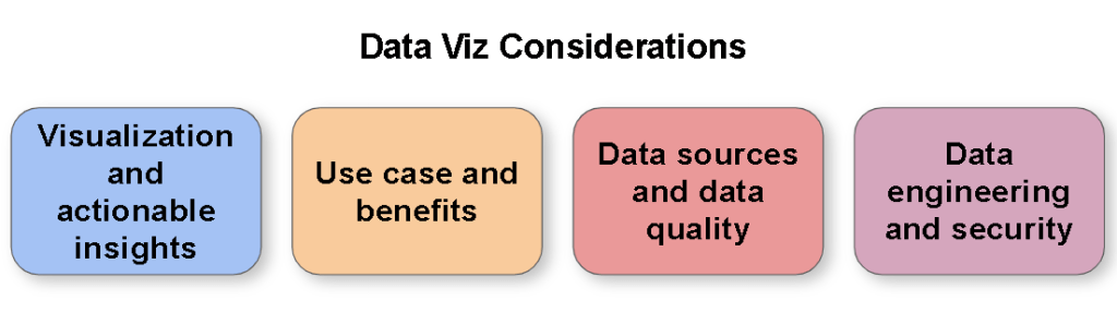
The visuals available within the Marketplace raises a number of key questions for a corporation:

  • Why is there a need to go beyond the default visualisations available within the tool?
  • How do users find the most suitable visual that meets their needs?
  • How do you train a user on how to use that visual, and use it for the right purpose?
  • How do you advise users on which visuals are the best ones and which ones to avoid?
  • If a visual doesn’t meet requirements, how do end users proceed?
  • A number of useful visuals require separate payment/license to get a full version, how does a corporation deal with this?
  • What are the long term considerations of using visuals from the Marketplace? How will they be supported in the long term? What happens if they are neglected?
  • What are the security considerations of visuals available from the Marketplace?

I will explore each of these questions in more detail, but I don’t have all the answers yet and would invite Microsoft, consultancies and the wider community to offer their views on these matters.

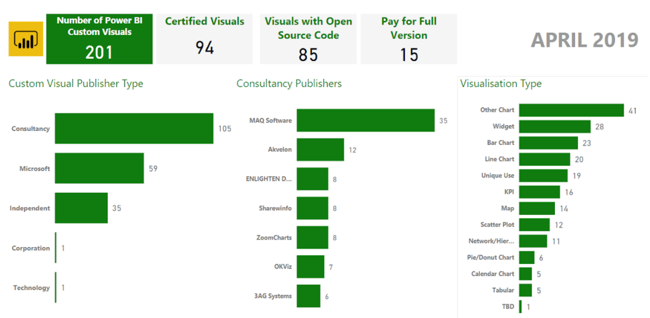
To help with my analysis I conducted some analysis on the visuals in the Marketplace, my categorisation is brief and open to interpretation/mistake but was good enough to help me with my assessment and give me a sense of what is in the Marketplace. Please see in the above dashboard the high level numbers. If Microsoft are able to make available a datasource of the available Custom Visuals that would be useful for next time!

Why is there a need to go beyond the default visualisations available within the tool?

The paradigm of how Power BI works is that a visual comes with a preset design which you can configure as dictated by the design. Users sometimes find they are constrained by this preset design in achieving the visual they need to meet their use case, or the type of visual they need isn’t available and therefore they will look to the market place to find an enhanced visual or different kind of visual to meet their needs.

For example, I have a use case where I want to use a line chart over time (eg for each product price), and based on another category colour the lines (eg there are several brands each with several products). However, with the Line chart that comes with Power BI I can only manually manipulate the colours (fairly tedious, especially when lots of categories, and lots of visuals) I can’t control them with another dimension. That will become a problem over time as new products get added. Therefore, can I find a visual on the marketplace that meets this need?

How do users find the most suitable visual that meets their needs?

Users can search the marketplace and Microsoft have created a categorisation to try and aid users in this as well.

Currently there are over 200 visuals for Power BI in the Marketplace. You would expect this to continue to grow over time.

If you search for Line Chart for example, you currently get over 75 results. So as an end user, you are going to have to spend time reviewing the results to try and find a visual that meets your requirement. This does often result in having to try many different visuals to find the one that does the job (assuming there is one that does meet the requirements). Therefore, an end user would look for recommendations to save themselves time and effort. Microsoft have their Editors Picks and other categorisations to help end users, but I’m convinced more could be done to help users.

How do you advise users on which visuals are the best ones and which ones to avoid?

As a corporation, I would have a central team and/or SMEs review the Power BI Visuals available in the Market Place and provide recommendations on which ones to use so that end users are able to arrive at a solution more quickly.

It would be very useful for an organisation to be able to configure their recommended visuals through the Power BI interface, similar to how an organisation can make custom visuals available: https://docs.microsoft.com/en-us/power-bi/power-bi-custom-visuals-organization

Data visualisation best practice is key to delivering successful dashboards, educating end users on this topic is no small undertaking. It would be prudent for organisations to advise users to avoid visuals that don’t meet best practices, or equally ones that are not well developed and have functional limitations (eg lack interactive filtering) or have significant bugs or don’t meet security requirements. Perhaps the option for an organisation to block such visuals would be a sensible approach.

How do you train a user on how to use that visual, and use it for the right purpose?

Each custom visual has a description, but further information about how to use it and when to use it is highly variable. Some are well documented and give videos and so forth, either on the store page or via links to comprehensive webpages. Others just have a brief description and a screenshot or two.

An option is to search for advice, for instance on the Pragmatic Works blog, Devin Knight has gone to a lot of effort to provide training for a good number of the custom visuals: http://blog.pragmaticworks.com/topic/power-bi-custom-visuals

Either way, there is a need to educate end users on visualisation best practices so they can choose the right visual or set of visuals for their use case. This is an in depth topic in itself, but every organisation should consider how to create this capability otherwise you end up with a mish-mash of reports with poor visual choice and all number of other issues that ultimately will lead the report not being used.

If a visual doesn’t meet requirements, how do end users proceed?

If the visual meets the majority of requirements, it would be pragmatic to first approach the publisher of that visual with feedback and ask them to enhance it. This of course may or may not happen and the time scale for any feedback to be incorporated could be highly variable.

The second approach is to create your own custom visual, potentially building on the existing one if it is open source code. https://docs.microsoft.com/en-us/power-bi/developer/custom-visual-develop-tutorial

However, this is going to beyond the ability of your average end user as it requires programming as well as a fair amount of time and effort. It would make sense to either outsource the requirement to a consultancy that build visuals or if available use an in-house team/subject matter expert who can be assigned to develop the required visual.

This obviously has a negative impact on delivery timescales and end users will have to either work within the limitations of the visuals that are available or put things on-hold until the required visual is developed.

A number of useful visuals require separate payment/license to get a full version, how does a corporation deal with this?

Within most corporations getting things through Procurement and Digital Security is no small undertaking.

Currently there are a number of visuals (I made it 15 at the time of writing) that only provide a functionally limited/watermarked version through the Marketplace and you have to go to an external site and make necessary payments to get the full version and license.

Having a brief scan of these sites, I think there are the following challenges when considering this:

  • There are a wide variety of licensing arrangements proposed which may or may not work for your organisation depending on size and global locations.
  • Some of these visuals have been developed by independent persons/small consultancies, so there is little “security” in the long term support of such visuals.
  • It will likely take considerable time for an organisation to process the procurement of the visual from a new supplier and make the necessary payments. If the visual is being purchased from an independent or small consultancy the likelihood of this being approved will likely be quite low.
  • It will also take time to perform the necessary security checks on such visuals. And the provider of the visual may not be willing to provide the source code to get it validated so you could  end up at a bit of an impasse. There will also be the need to revalidate the code every time there is an update.

Obviously the developers of these custom visuals have put a considerable amount of time and effort into building them and have a business case to get payment.

I’m not sure what the right way forwards on this question is. Perhaps Microsoft can provide an ecosystem for appropriate payment that would be more acceptable for corporations to process. Microsoft have recently implemented an approach to certify and then flag the custom visual as requiring further purchase https://powerbi.microsoft.com/en-us/blog/new-monetization-option-for-power-bi-custom-visuals-through-appsource/ but as far as I can tell you still need to engage directly with the 3rd party for the full license key so that doesn’t solve the procument issues, but does cover the security issues as it is certified and therefore checked by Microsoft.

Perhaps Microsoft should come to some arrangement to provide such visuals as part of licensing arrangements with organisations and then manage payment and set-up with these third party providers themselves?

Organisations also have the risk that end users circumnavigate procurement and digital security processes and purchase directly from the developers. I would hope that the Power BI service can be monitored for use of non-approved custom visuals, so this is something that should be considered by an organisation.

Not that I’ve done an extensive search, but I can also see that there are suppliers who don’t offer their custom visuals through the Marketplace at all, eg Zebra BI https://zebrabi.com/power-bi-custom-visuals/ and therefore an organisation would need to seek them out and ascertain for themselves if there is value in what they provide given any monetary, commercial and security considerations.

What are the long term considerations of using visuals from the Marketplace? How will they be supported in the long term? What happens if they are neglected?

It would be reasonable to assume that there will be continued growth in the amount of visuals available in the Marketplace, to the point where there easily could be several hundred or more. This would exacerbate the challenge of finding the right visual for your use case.

As Microsoft updates Power BI over the coming months and years, there is a risk that a custom visual stops working (in part or entirety) due to updates in the API. If the developer of the visual is no longer able or willing to maintain this visual what happens? There is also the risk that new key Power BI functionality is not incorporated into the visual, and therefore it becomes obsolete.

Will Microsoft “cleanse” the Marketplace of such visuals? How will the impact to end users be managed if they have used one of these legacy visuals that is now no longer supported? Will Microsoft pick up any of these legacy visuals and provide continued support themselves to mitigate this risk?

Even briefly reading the reviews and community articles, it comes across that some of the current set of visuals available in the Marketplace have bugs or already lack key features that users come to expect. I don’t have time for an in-depth assessment to verify, but it does raise concerns on the quality of custom visuals available in the Marketplace.

What are the security considerations of visuals available from the Marketplace?

Anyone can submit a visual to the Marketplace. Microsoft also allow developers to get their visual certified provided it meets specific criteria

https://docs.microsoft.com/en-us/power-bi/power-bi-custom-visuals-certified

https://docs.microsoft.com/en-us/power-bi/power-bi-custom-visuals-certified?#certification-requirements

Here is the list of Power BI Custom Visuals that have been certificated. Note that Microsoft can remove this certification at any time.

https://docs.microsoft.com/en-us/power-bi/power-bi-custom-visuals-certified#list-of-custom-visuals-that-have-been-certified

There is a risk for any custom visual that has not been certified by Microsoft that it could send data externally. Here a few blog posts on the subject.

https://www.efexcon.com/blog/are-all-custom-visuals-in-power-bi-secure

https://datasavvy.me/2019/02/28/what-data-is-being-sent-externally-by-power-bi-visuals/

Therefore, as a corporation I would want to block the use of any non-certified custom visuals unless they have been reviewed by Digital Security and approved. These reviews may not be possible if the custom visual is not an open source visual unless the third party is willing to share their code.

If I’m running the Power BI Service Is there a way to ensure that custom visuals don’t connect to the internet without approval by an organisation? How does a corporation manage this risk effectively, the current situation suggests a number of processes would need to be put in place.

Microsoft also suggest that the Certification could be removed at any point, so organisations that rely on it would also have to consider this.

Conclusions

The current situation poses a number of key questions and I recommend organisations carefully consider the impact of the Power BI Marketplace now and for the future to ensure they don’t run into some of the challenges outlined such as insecure visualisations and end users being overwhelmed by what to do. My key recommendations for an organisation are:

  • Produce and maintain a curated list of which custom visuals end users should consider using first.
  • Block custom visuals that aren’t certified to ensure security and any other custom visuals that the organisation do not want end users to consider using.
  • Put in place a process for a team/3rd party to develop custom visuals on behalf of end users if there is a use case to do so.
  • Consider how to process procurement of custom visuals that require payment if there is a use case to do so.
  • As part of a wider consideration, grow end user capability in terms of data visualisation best practices so that end users use the right custom visual for their use case.

I welcome any feedback and input into this topic, please comment or get in touch.


The Data Iceberg

Embarking on a project to deliver data visualisations? Data Iceberg

Do not underestimate the data iceberg which will capsize your delivery.

In my experience, getting your data right is the biggest challenge, building the data visualisation is the easy bit!

Common issues in corporations include:

  • You need to jump through several “hoops” to get access and connect to the data. This can end up taking several months if you need to get changes into a release cycle.
  • The data you need is actually spread across several databases and you need to align and bring all this data together.
  • There are often a number of “off-system” data sets you need to uncover and map into your data set, eg budget holder mappings, reporting hierarchies.
  • There maybe issues with the quality of your data, either data is missing or been incorrectly/inconsistently entered. This might even require you to enact some level of business change to get the data sorted.
  • You will need to prepare the data into a sensible structure to visualise with. Consider how you set-up your dimensions and measures, particularly with respect to time dimensions and hierarchies. Often I get prior periods pre-calculated in the data source so it simple to reference when building the visualisation.
  • An iterative situation, but generally you will want to push calculations and business logic into your dataset so that you don’t take the performance hit on the visualisation side.
  • Business users apply additional adjustments or logic on top of the data before presenting it. Often this can be to workaround limitations of the source system or just to deal other situations they have accommodated for over the years. Be prepared to dive into end user Excel spreadsheets and unravel something that was set-up years ago and the original creator isn’t about anymore.

There is no easy solution to dealing with these, but if you go in preparing for such issues and anticipating that you will find them (for you will!), then you can be more realistic with your approach and timescales.

Best of luck and I hope your delivery doesn’t sink!


Interviewing for Data Visualisation

Having just interviewed ten people inside a week for some data visualisation roles within my company I thought it would be useful to share some reflections on this and my thoughts on key skills and capabilities when looking for good resources.

Percentages and Visualisation

Data Visualisation Skills

I’m going to break down the key skills into five areas:

  • Artist: The ability to design an aesthetically pleasing and well design dashboard.
  • Data Analysis: The ability to understand and analyse data as well as how to structure it.
  • Business Analysis: The ability to understand the use case, requirements and work with stakeholders in this regards.
  • Design Thinking: The ability to design a user friendly dashboard.
  • Tool Know-How: Knowledge of a data visualisation tool and how to use it efficiently and effectively

Generally speaking I’m expecting someone to have proficient level in all of these areas, arguably business analysis and data analysis can be complimented by analysts in the team, but realistically a good data visualisation resource needs these skills as well to be able to challenge requirements, propose their own solutions as well as quickly identify data issues and propose changes.cropped-plan-vs-actuals

So in terms of the above skills, what would I consider the good, the bad and the ugly?!?

Artist

Advanced Artist: Able to produce top of the range professional looking dashboards, using features such as visualisations in tooltips and approaches such as guided analytics to build a very effective dashboard.

Good Artist: Able to build a well laid out dashboard that is pleasing to view and flows. Good data to ink ratio (no unnecessary axis, labels, legends, etc and sensible choice of colours that add value to the visualisation (less is generally best)

Bad Artist: Inconsistent use of colours, unnecessary labels and axis and poor data to ink ratio.

Ugly Artist: Too many colours and too many controls and filters cluttering up the dashboard. Poor layout and dashboard flow.

Data Analysis

Advanced Data Analysis: Can proficiently use data preparation tools (eg Alteryx, Power BI’s power query, Tableau Prep) or languages (SQL, Python,etc) to restructure data sets or bring data sets together. Analysing, cleansing and tidying  the data to enable a robust data flow. Also considers the impact of the data set on performance and employs techniques such as guided analytics to build sensible data sources to support the data visualisation.

Good Data Analysis:  Can analyse and understand data structures as well as calculations, their impact on a visualisation, and can either rework the data themselves or inform data engineers of their requirements. Has a reasonable understanding of joins, blends and unions and how to use them effectively.   For instance reworking a hierarchy to flatten the structure for presentation purposes or building prior month/year logic into the datamart.

Bad Data Analysis:  Doesn’t consider what will happen when the data set changes over time and the impact on the data visualisation. Works around poor data sets by putting extra effort into the data visualisation to compensate; which may end up compromising the dashboard and possibly resulting in poor performance.

Ugly Data Analysis: Creates a “spaghetti soup” of a data flow, possibly creating Cartesian joins and a poor quality data set that results in an “untrustworthy” data set and therefore dashboard. Doesn’t see data quality issues such as missing data or performs incorrect calculations such as summing percentages.

Business Analysis

Advanced Business Analysis: Able to generate a high level of engagement and collaboration with users/stakeholders. Can work out how to elicit the real use case and can convince users/stakeholders on the most appropriate approach and data visualisations. Can recommend and influence business process changes to improve the data set or use of the data visualisations.

Good Business Analysis: Able to challenge requirements, or clarify vague requirements and propose approaches to meet user needs.  Able to build a rapport with dedicated business analysts and/or stakeholders and work towards business objectives.

Bad Business Analysis: Follows requirements without challenging them or understanding the use case and what is trying to be achieved.

Ugly Business Analysis: Misinterprets requirements, ignores or doesn’t engage with analysts or end users and produces solutions that don’t provide any value.

Design Thinking

Advanced Design Thinking: Creates a dashboard or set of dashboards that are intuitive to use without any guidance or training.  Design principles are applied consistently and there is efficient use of controls and interactions.  Able to create advanced visualisations and chooses the right visualisation for the right message. Uses Guided Analytic principles to enable users to drill into the detail and explore the data.

Good Design Thinking: Well thought out controls and interactions that enable a user to make the most of the data and answer their questions. Sensible selection of data visualisations (eg bar charts, line charts, bullet graphs).

Bad Design Thinking: Poor use of controls, dashboard requires explanation to use and is inconsistent in how a user interacts with it. Could choose better visualisations or use them appropriately to present the data effectively.

% Health on GDP

Ugly Design Thinking: A mess of different controls or interactions, dashboards are difficult to use and often results in confusing outcomes, eg returning too many results, filters applying to some visualisations but not others. Poor choice of visualisations, particularly pie charts or stacked charts with lots of categories. I often see overuse of maps which take up a lots of space and provide little use if geography isn’t relevant.

Tool Know-How

Advanced Tool Know-How: Thoroughly understands how to make the best use of a tools capabilities, can workaround limitations and able to implement more complex visualisations and calculations (eg Level of Detail) to meet requirements. Can debug or redesign existing dashboards to improve them. Also has a good understanding of the implications of publishing to servers and the features and capabilities they can utilise, including security, alerts, subscriptions, etc. Also able to coach and guide others on use of the tool.

Good Tool Know-How: Has a solid understanding of the tool and can quickly build visualisations and is able to create efficient calculations and also interactions. Also understands key aspects of publishing dashboards to servers and securing data and dashboards appropriately. Ensures that the dashboard is robust and also has knowledge transfer set-up (eg calculations comments, documentation, etc)

Bad Tool Know-How: Doesn’t always choose the best way to implement calculations (resulting in performance implications), can struggle to build anything beyond basic visualisations and often creates bugs that need resolving. Has a poor understanding of the implications of publishing the dashboard and how to share it with the audience.

Ugly Tool Know-How: It’s a significant challenge for them to use the tool at all, and they need significant input and guidance to build dashboards, often resulting in considerable rework.

It’s difficult to be completely prescriptive on the above suggestions and there are many facets to being good at data visualisation, but hopefully it will provide a good general consideration for most situations.

Advice & Learning

With respect to the above areas, if you are starting out on data visualisation or want to improve your existing capabilities there are lots of ways to learn and develop. A few recommendations I would make:

Interview Questions

Typically when interviewing for data visualisation roles I send some pre-work to the candidates, asking them to build some dashboards to answer several questions to test their abilities and showcase their skills and really demonstrate if they know their stuff. A tools pre-loaded data sets are a good choice as they readily available. You can also ask the candidate to provide a portfolio of their work, but this is sometimes a challenge as the dashboards they have created for other companies are commercially sensitive and can’t be shared.

An example of typical questions/areas to explore are:

  • Can you provide an example of where you have had to deal with a requirement that is vague or unclear?
  • Can you provide an example of where you have challenged a requirement and proposed and reached an agreement on a better solution?
  • Stakeholders can be often be challenging to convince on the advantages of data visualisations, can you talk about a situation when you have dealt with challenging stakeholders with respect to data visualisations?
  • What are the key performance considerations when building a dashboard?
  • Data sets can often require a lot of work to enable a visualisation to be achieved; can you talk through a situation when you have required significant work on the data set to be successful in your delivery and how you achieved this?
  • What factors do you take into account in creating a dashboard that is robust and supportable?
  • Can you provide an example of where you have had to redesign an existing dashboard and talk through how you achieved this?
  • How do you develop and maintain your skills and capabilities in the area of data visualisation?
  • Can you provide an example of where you have used Guided Analytics or other such techniques to deliver a more effective dashboard?

Feel free to use these questions as a framework for your interview and best of luck.

Context and About Me

The tool in question we were hiring for was Tableau, but the same approach would apply for any visualisation tool.

I’m focused on building corporate management information/governance dashboards and I’ve therefore not considered “data science”/analytics skill sets or ‘data engineer’ skill sets which although having some overlap have other distinct needs.

Nigel Davison is a self-confessed data visualisation addict and leads a delivery team within BP in the Downstream (petrol stations, refineries, etc) segment and has been recognised as a Senior Expert in Data Visualisation and also Tableau within the company.