Having just interviewed ten people inside a week for some data visualisation roles within my company I thought it would be useful to share some reflections on this and my thoughts on key skills and capabilities when looking for good resources.
Data Visualisation Skills
I’m going to break down the key skills into five areas:
- Artist: The ability to design an aesthetically pleasing and well design dashboard.
- Data Analysis: The ability to understand and analyse data as well as how to structure it.
- Business Analysis: The ability to understand the use case, requirements and work with stakeholders in this regards.
- Design Thinking: The ability to design a user friendly dashboard.
- Tool Know-How: Knowledge of a data visualisation tool and how to use it efficiently and effectively
Generally speaking I’m expecting someone to have proficient level in all of these areas, arguably business analysis and data analysis can be complimented by analysts in the team, but realistically a good data visualisation resource needs these skills as well to be able to challenge requirements, propose their own solutions as well as quickly identify data issues and propose changes.
So in terms of the above skills, what would I consider the good, the bad and the ugly?!?
Artist
Advanced Artist: Able to produce top of the range professional looking dashboards, using features such as visualisations in tooltips and approaches such as guided analytics to build a very effective dashboard.
Good Artist: Able to build a well laid out dashboard that is pleasing to view and flows. Good data to ink ratio (no unnecessary axis, labels, legends, etc and sensible choice of colours that add value to the visualisation (less is generally best)
Bad Artist: Inconsistent use of colours, unnecessary labels and axis and poor data to ink ratio.
Ugly Artist: Too many colours and too many controls and filters cluttering up the dashboard. Poor layout and dashboard flow.
Data Analysis
Advanced Data Analysis: Can proficiently use data preparation tools (eg Alteryx, Power BI’s power query, Tableau Prep) or languages (SQL, Python,etc) to restructure data sets or bring data sets together. Analysing, cleansing and tidying the data to enable a robust data flow. Also considers the impact of the data set on performance and employs techniques such as guided analytics to build sensible data sources to support the data visualisation.
Good Data Analysis: Can analyse and understand data structures as well as calculations, their impact on a visualisation, and can either rework the data themselves or inform data engineers of their requirements. Has a reasonable understanding of joins, blends and unions and how to use them effectively. For instance reworking a hierarchy to flatten the structure for presentation purposes or building prior month/year logic into the datamart.
Bad Data Analysis: Doesn’t consider what will happen when the data set changes over time and the impact on the data visualisation. Works around poor data sets by putting extra effort into the data visualisation to compensate; which may end up compromising the dashboard and possibly resulting in poor performance.
Ugly Data Analysis: Creates a “spaghetti soup” of a data flow, possibly creating Cartesian joins and a poor quality data set that results in an “untrustworthy” data set and therefore dashboard. Doesn’t see data quality issues such as missing data or performs incorrect calculations such as summing percentages.
Business Analysis
Advanced Business Analysis: Able to generate a high level of engagement and collaboration with users/stakeholders. Can work out how to elicit the real use case and can convince users/stakeholders on the most appropriate approach and data visualisations. Can recommend and influence business process changes to improve the data set or use of the data visualisations.
Good Business Analysis: Able to challenge requirements, or clarify vague requirements and propose approaches to meet user needs. Able to build a rapport with dedicated business analysts and/or stakeholders and work towards business objectives.
Bad Business Analysis: Follows requirements without challenging them or understanding the use case and what is trying to be achieved.
Ugly Business Analysis: Misinterprets requirements, ignores or doesn’t engage with analysts or end users and produces solutions that don’t provide any value.
Design Thinking
Advanced Design Thinking: Creates a dashboard or set of dashboards that are intuitive to use without any guidance or training. Design principles are applied consistently and there is efficient use of controls and interactions. Able to create advanced visualisations and chooses the right visualisation for the right message. Uses Guided Analytic principles to enable users to drill into the detail and explore the data.
Good Design Thinking: Well thought out controls and interactions that enable a user to make the most of the data and answer their questions. Sensible selection of data visualisations (eg bar charts, line charts, bullet graphs).
Bad Design Thinking: Poor use of controls, dashboard requires explanation to use and is inconsistent in how a user interacts with it. Could choose better visualisations or use them appropriately to present the data effectively.
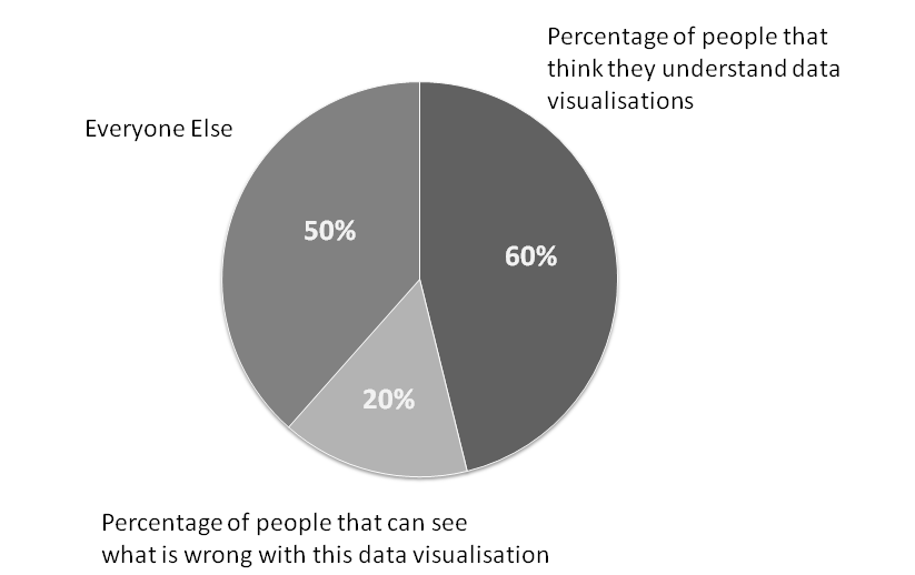
Ugly Design Thinking: A mess of different controls or interactions, dashboards are difficult to use and often results in confusing outcomes, eg returning too many results, filters applying to some visualisations but not others. Poor choice of visualisations, particularly pie charts or stacked charts with lots of categories. I often see overuse of maps which take up a lots of space and provide little use if geography isn’t relevant.
Tool Know-How
Advanced Tool Know-How: Thoroughly understands how to make the best use of a tools capabilities, can workaround limitations and able to implement more complex visualisations and calculations (eg Level of Detail) to meet requirements. Can debug or redesign existing dashboards to improve them. Also has a good understanding of the implications of publishing to servers and the features and capabilities they can utilise, including security, alerts, subscriptions, etc. Also able to coach and guide others on use of the tool.
Good Tool Know-How: Has a solid understanding of the tool and can quickly build visualisations and is able to create efficient calculations and also interactions. Also understands key aspects of publishing dashboards to servers and securing data and dashboards appropriately. Ensures that the dashboard is robust and also has knowledge transfer set-up (eg calculations comments, documentation, etc)
Bad Tool Know-How: Doesn’t always choose the best way to implement calculations (resulting in performance implications), can struggle to build anything beyond basic visualisations and often creates bugs that need resolving. Has a poor understanding of the implications of publishing the dashboard and how to share it with the audience.
Ugly Tool Know-How: It’s a significant challenge for them to use the tool at all, and they need significant input and guidance to build dashboards, often resulting in considerable rework.
It’s difficult to be completely prescriptive on the above suggestions and there are many facets to being good at data visualisation, but hopefully it will provide a good general consideration for most situations.
Advice & Learning
With respect to the above areas, if you are starting out on data visualisation or want to improve your existing capabilities there are lots of ways to learn and develop. A few recommendations I would make:
- Read books on the subject – eg Big Book of Dashboards or Information Dashboard Design
- Attend suitable courses – eg Tableau Visual Analytics
- Participate in community events such as Makeover Monday or events within your company
- Ask more experienced people to peer review your dashboards and get feedback on how you can improve.
Interview Questions
Typically when interviewing for data visualisation roles I send some pre-work to the candidates, asking them to build some dashboards to answer several questions to test their abilities and showcase their skills and really demonstrate if they know their stuff. A tools pre-loaded data sets are a good choice as they readily available. You can also ask the candidate to provide a portfolio of their work, but this is sometimes a challenge as the dashboards they have created for other companies are commercially sensitive and can’t be shared.
An example of typical questions/areas to explore are:
- Can you provide an example of where you have had to deal with a requirement that is vague or unclear?
- Can you provide an example of where you have challenged a requirement and proposed and reached an agreement on a better solution?
- Stakeholders can be often be challenging to convince on the advantages of data visualisations, can you talk about a situation when you have dealt with challenging stakeholders with respect to data visualisations?
- What are the key performance considerations when building a dashboard?
- Data sets can often require a lot of work to enable a visualisation to be achieved; can you talk through a situation when you have required significant work on the data set to be successful in your delivery and how you achieved this?
- What factors do you take into account in creating a dashboard that is robust and supportable?
- Can you provide an example of where you have had to redesign an existing dashboard and talk through how you achieved this?
- How do you develop and maintain your skills and capabilities in the area of data visualisation?
- Can you provide an example of where you have used Guided Analytics or other such techniques to deliver a more effective dashboard?
Feel free to use these questions as a framework for your interview and best of luck.
Context and About Me
The tool in question we were hiring for was Tableau, but the same approach would apply for any visualisation tool.
I’m focused on building corporate management information/governance dashboards and I’ve therefore not considered “data science”/analytics skill sets or ‘data engineer’ skill sets which although having some overlap have other distinct needs.
Nigel Davison is a self-confessed data visualisation addict and leads a delivery team within BP in the Downstream (petrol stations, refineries, etc) segment and has been recognised as a Senior Expert in Data Visualisation and also Tableau within the company.
